Publication Spreads Featuring Type Designer

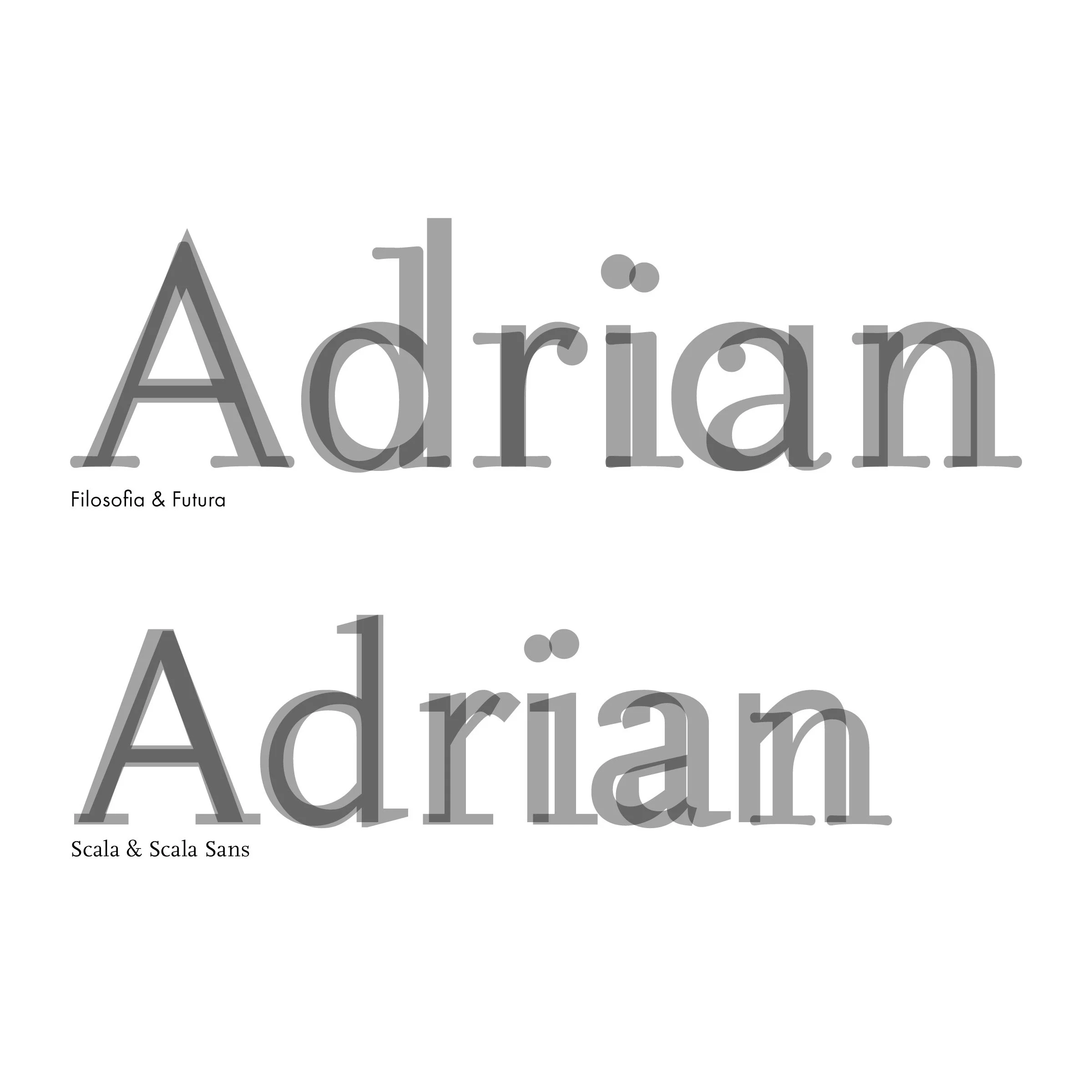
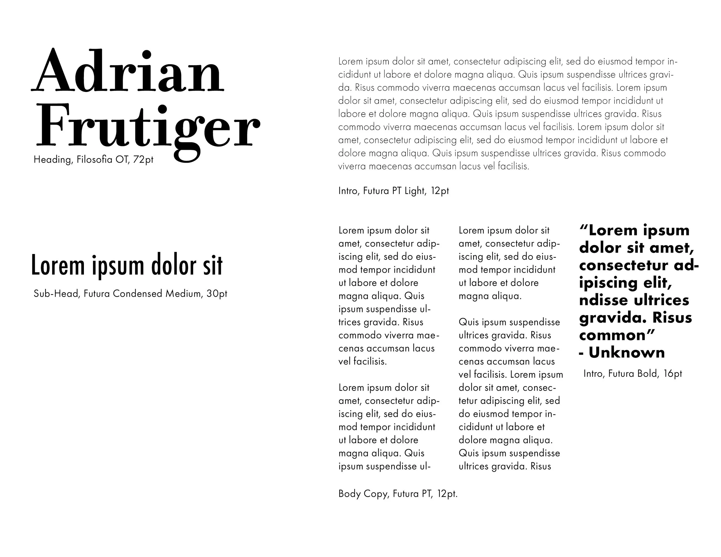
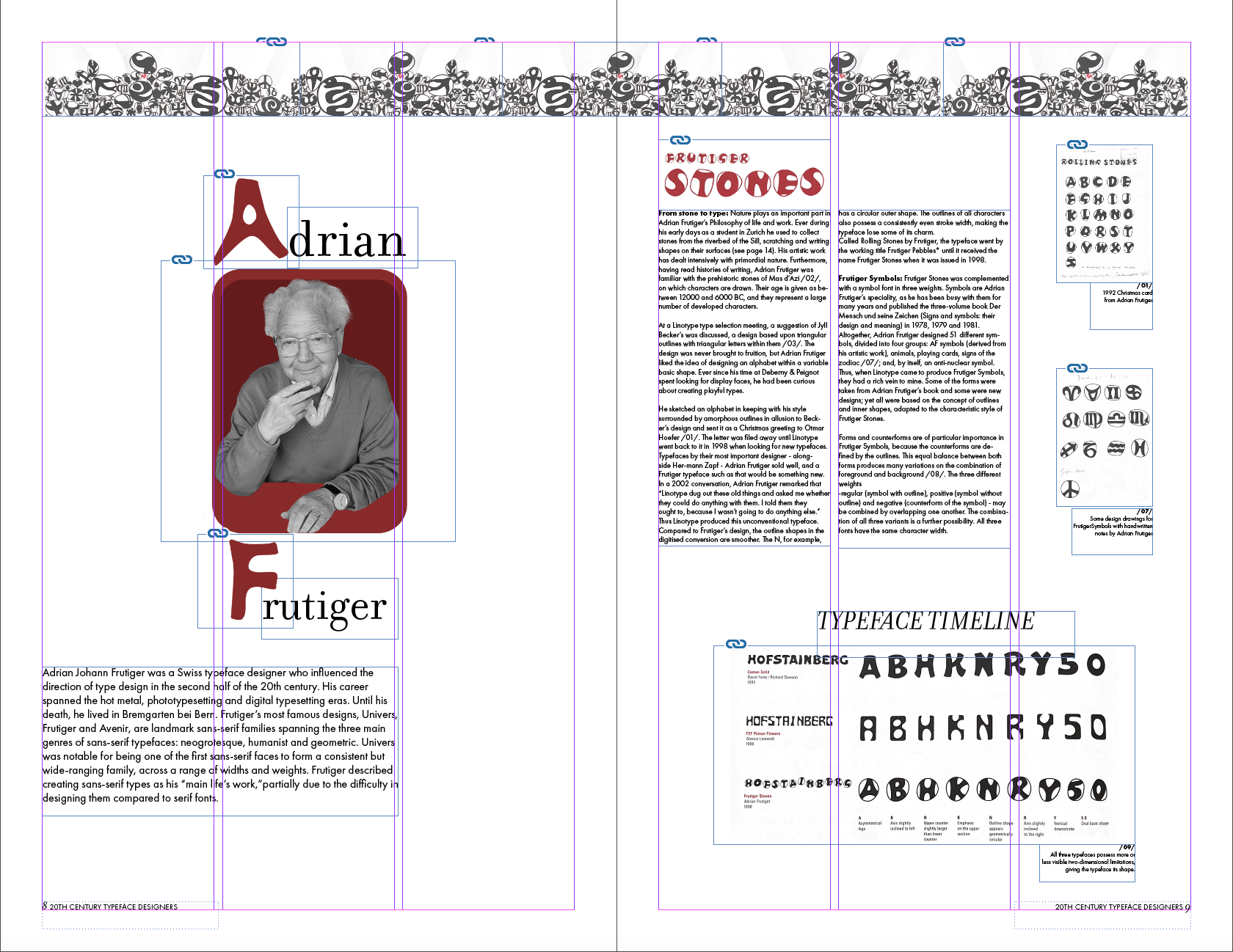
The objective of this project was to research and chose a type designer of my liking and feature their work in a publication. I chose Adrian Frutiger as my type designer and Futura and Filosophia as my typeface, which I later changed to his typefaces: Vectora and Didot Linotype. I worked through the assigning of different type styles to the various text elements of the layout such as titles, headings, subheads, body copy, captions, pull quotes, headers, footers, folios, and sidebars. I then designed and implemented a column grid, considering margin and hang lines and implemented parent pages, paragraph styles, threaded text and demonstrate familiarity with the use of baseline grid and maintained leading. For the color palette, I stuck with Adrian Frutiger’s style of white, red, and black, which makes the piece look very clean and put together.
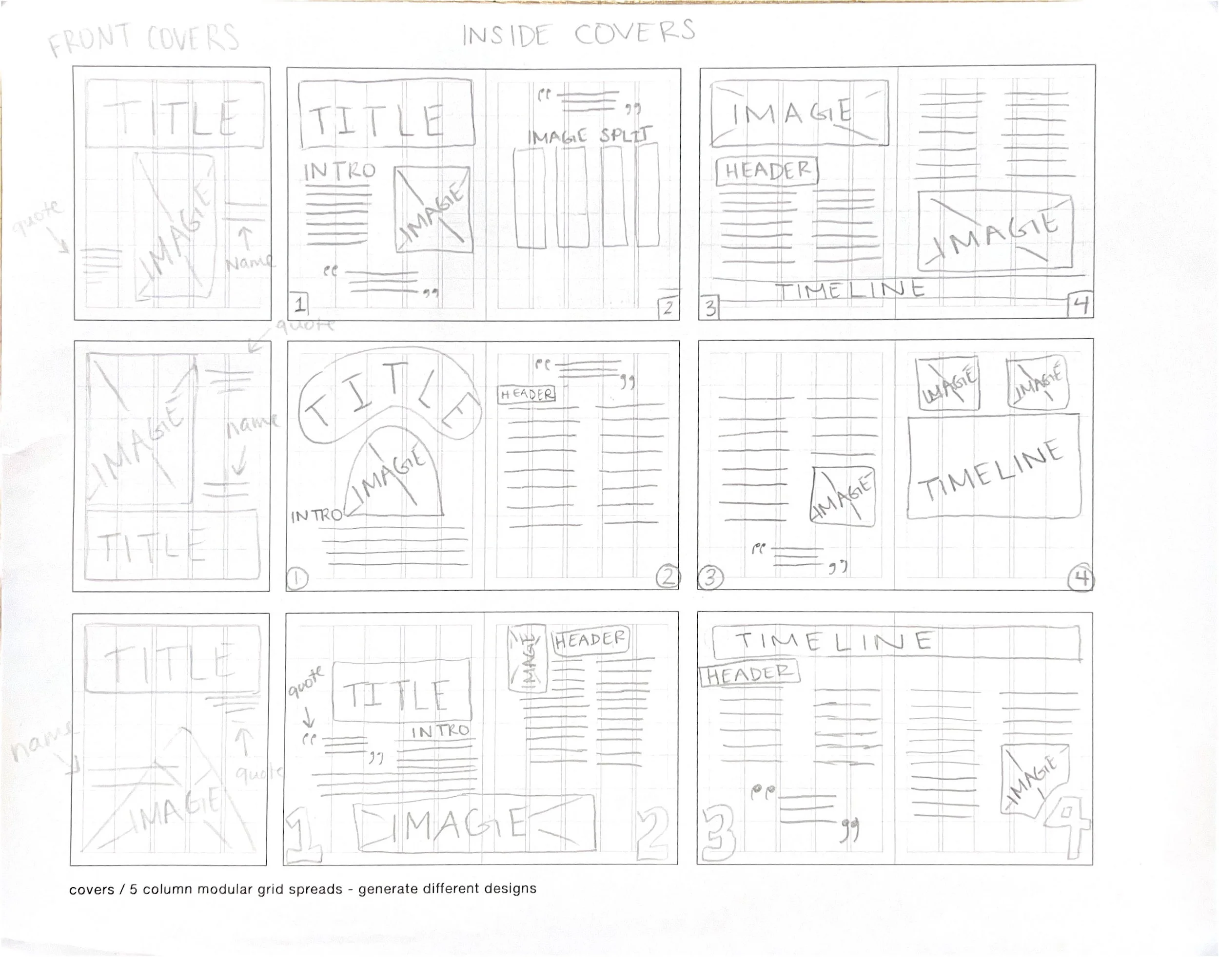
The challenges I went through while designing my publication was feeling lost in the beginning. Although I made thumbnails to help me, I got confused with how to create paragraph styles and maintaining the grid. As I made more roughs, I got a better idea on how to work with the grid. A goal that I set for myself while designing was to get away from framing and using color to take the place of empty white space. I struggled with that in the beginning, but was able to get myself out of my comfort zone and not do that.